BAEBSAE
DESIGN
COMPANY
Branding & Visual Development
Symbol & Logo Development · Color System
Typography · Graphic Motive · Offline Collateral
Website · UI/UX · SNS Feed · App Icon · Ad Banner
Detailed Product Page · Promotional Video
Brand Newsletter · Brand Guide · 3D Graphic
Project Inpatient Guidebook
Catalog Design


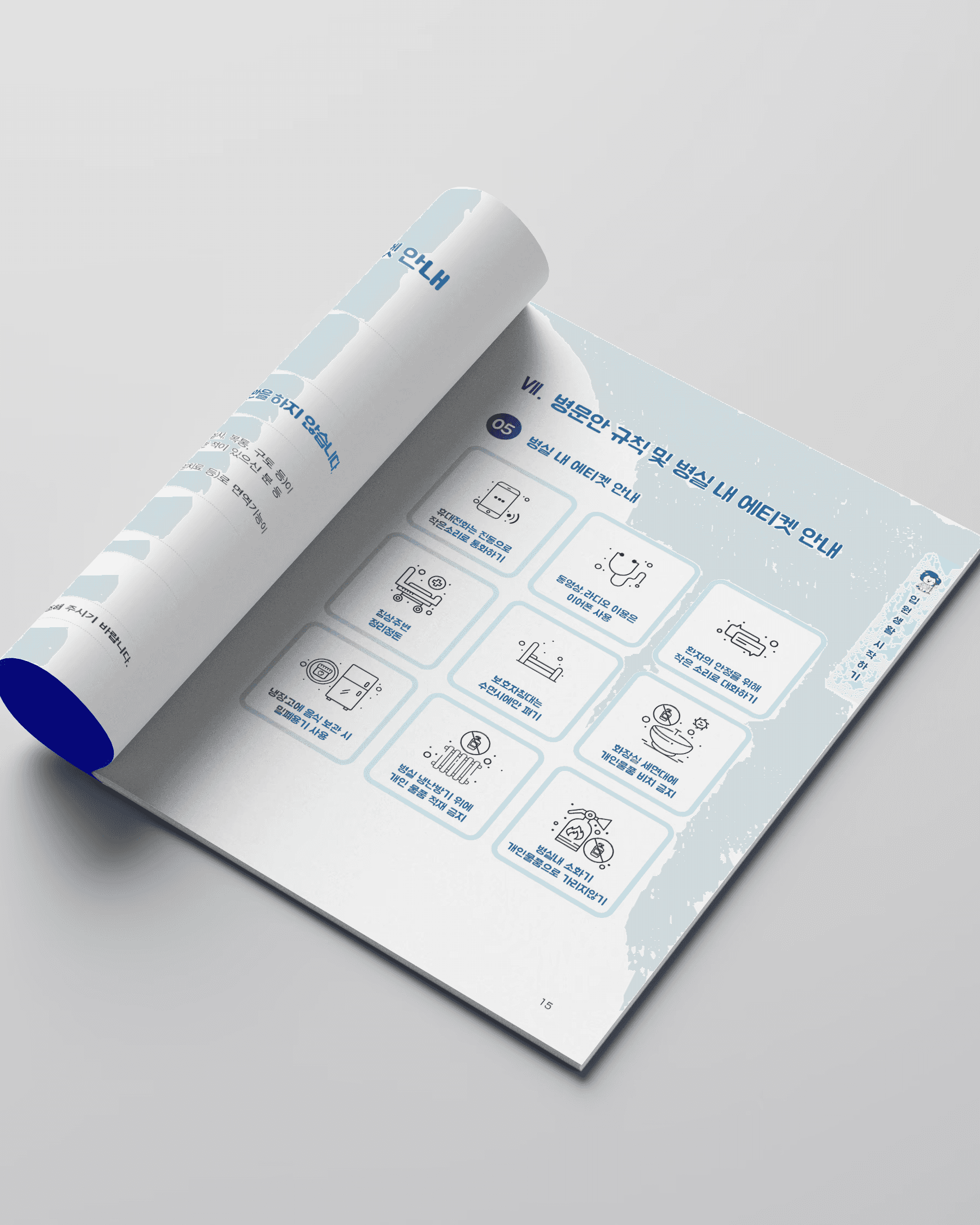


This design focuses on conveying professional trust and psychological stability by utilizing Hanyang University Hospital’s signature blue as the primary color. To help patients and families easily navigate complex hospital systems, intuitive pictograms and organized typography were implemented to maximize readability. By actively incorporating the hospital mascot and friendly illustrations, the guide was transformed from a rigid medical document into a warm, approachable, and user-centered guide. The balance between a structured layout and clean white space maintains a professional image while ensuring the effective delivery of practical information.
본 디자인은 한양대학교병원의 아이덴티티 컬러인 블루를 주조색으로 활용하여 의료 기관으로서의 신뢰감과 심리적 안정감을 동시에 전달하는 데 집중했습니다. 환자와 보호자가 복잡한 병원 시스템을 한눈에 파악할 수 있도록 직관적인 픽토그램과 정돈된 타이포그래피를 사용하여 정보의 가독성을 극대화했습니다. 특히 병원 마스코트와 친근한 일러스트레이션을 적극적으로 배치해 자칫 경직될 수 있는 병원 안내서를 따뜻하고 접근하기 쉬운 사용자 중심의 가이드로 탈바꿈시켰습니다. 체계적인 레이아웃과 여백의 조화는 전문적인 인상을 유지하면서도 실용적인 정보 전달력을 높이는 역할을 합니다.
Project Guide for Inpatients
Catalog Design
This design focuses on conveying professional trust and psychological stability by utilizing Hanyang University Hospital’s signature blue as the primary color. To help patients and families easily navigate complex hospital systems, intuitive pictograms and organized typography were implemented to maximize readability. By actively incorporating the hospital mascot and friendly illustrations, the guide was transformed from a rigid medical document into a warm, approachable, and user-centered guide. The balance between a structured layout and clean white space maintains a professional image while ensuring the effective delivery of practical information.
본 디자인은 한양대학교병원의 아이덴티티 컬러인 블루를 주조색으로 활용하여 의료 기관으로서의 신뢰감과 심리적 안정감을 동시에 전달하는 데 집중했습니다. 환자와 보호자가 복잡한 병원 시스템을 한눈에 파악할 수 있도록 직관적인 픽토그램과 정돈된 타이포그래피를 사용하여 정보의 가독성을 극대화했습니다. 특히 병원 마스코트와 친근한 일러스트레이션을 적극적으로 배치해 자칫 경직될 수 있는 병원 안내서를 따뜻하고 접근하기 쉬운 사용자 중심의 가이드로 탈바꿈시켰습니다. 체계적인 레이아웃과 여백의 조화는 전문적인 인상을 유지하면서도 실용적인 정보 전달력을 높이는 역할을 합니다.
MENU
MENU