BAEBSAE
DESIGN
COMPANY
Branding & Visual Development
Symbol & Logo Development · Color System
Typography · Graphic Motive · Offline Collateral
Website · UI/UX · SNS Feed · App Icon · Ad Banner
Detailed Product Page · Promotional Video
Brand Newsletter · Brand Guide · 3D Graphic
Project Green Tasty Gunsan
SNS card news Design

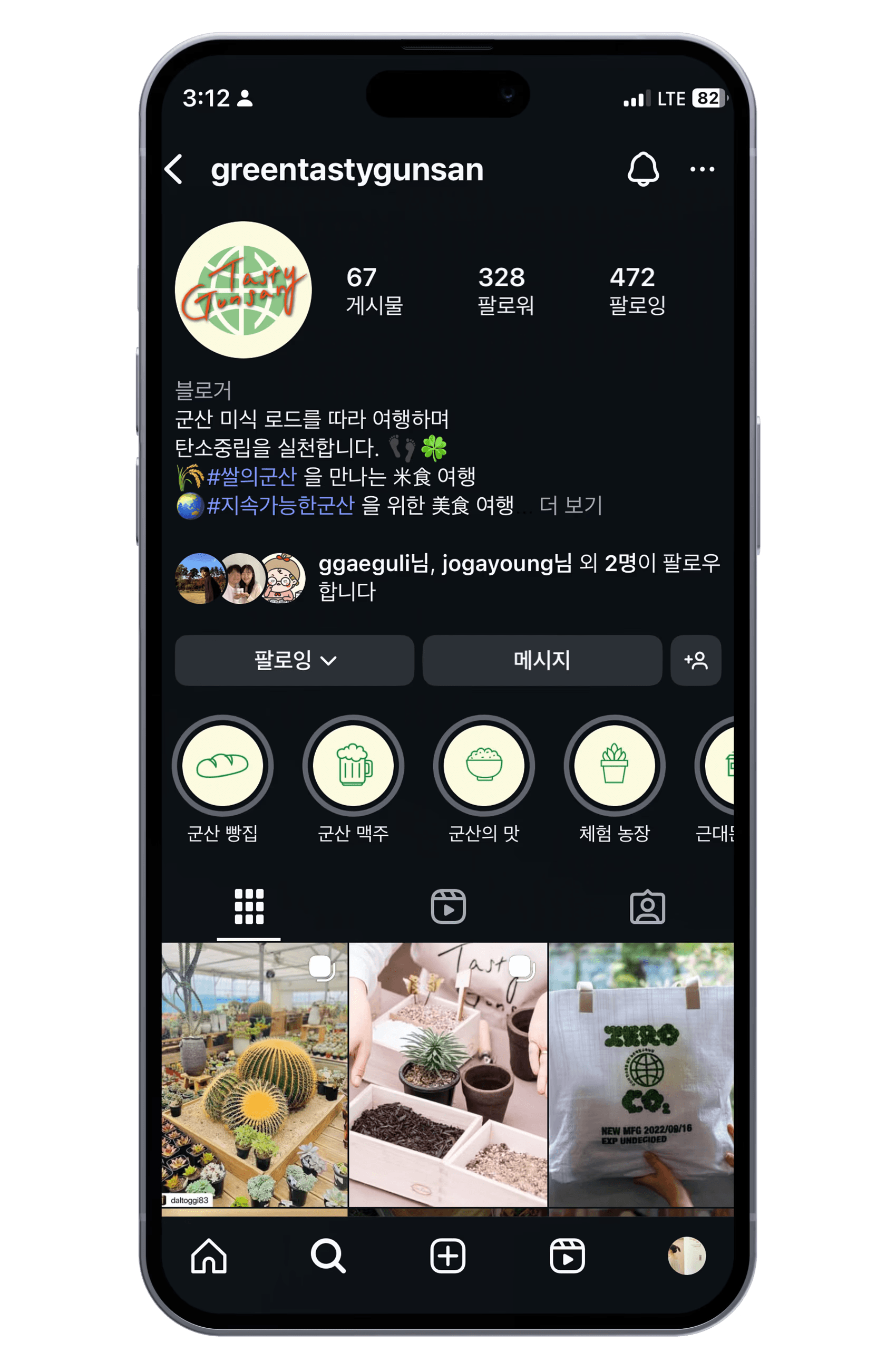
The SNS design for the Green + Tasty Trip campaign effectively communicates a healthy brand image by combining eco-friendly 'carbon neutrality' values with 'Gunsan's gastronomy.' A palette of nature-inspired green and soothing ivory creates visual stability, while the globe-shaped logo and intuitive pictograms clearly define the campaign's purpose. The strategic blend of data-driven infographics and authentic local food photography ensures both informative clarity and emotional appeal. Furthermore, the consistent layout of the card news builds professional trust and effectively motivates users to engage in sustainable travel.
그린+미식여행 캠페인의 SNS 디자인은 '탄소중립'이라는 친환경 가치와 '군산의 미식'을 결합하여 밝고 건강한 브랜드 이미지를 전달합니다. 자연을 상징하는 그린과 편안한 아이보리 톤을 메인 컬러로 사용해 시각적 안정감을 주었으며, 지구 형상의 로고와 직관적인 픽토그램을 통해 캠페인의 성격을 명확히 드러냅니다. 특히 데이터 중심의 인포그래픽과 실제 로컬푸드 이미지를 조화롭게 배치하여 정보 전달력과 감성적인 소구력을 동시에 확보했습니다. 일관된 레이아웃의 카드뉴스는 사용자에게 전문적인 신뢰감을 주며, 지속 가능한 여행에 대한 동기를 효과적으로 유발합니다.
Project Green Tasty Gunsan
SNS card news Design
The SNS design for the Green + Tasty Trip campaign effectively communicates a healthy brand image by combining eco-friendly 'carbon neutrality' values with 'Gunsan's gastronomy.' A palette of nature-inspired green and soothing ivory creates visual stability, while the globe-shaped logo and intuitive pictograms clearly define the campaign's purpose. The strategic blend of data-driven infographics and authentic local food photography ensures both informative clarity and emotional appeal. Furthermore, the consistent layout of the card news builds professional trust and effectively motivates users to engage in sustainable travel.
그린+미식여행 캠페인의 SNS 디자인은 '탄소중립'이라는 친환경 가치와 '군산의 미식'을 결합하여 밝고 건강한 브랜드 이미지를 전달합니다. 자연을 상징하는 그린과 편안한 아이보리 톤을 메인 컬러로 사용해 시각적 안정감을 주었으며, 지구 형상의 로고와 직관적인 픽토그램을 통해 캠페인의 성격을 명확히 드러냅니다. 특히 데이터 중심의 인포그래픽과 실제 로컬푸드 이미지를 조화롭게 배치하여 정보 전달력과 감성적인 소구력을 동시에 확보했습니다. 일관된 레이아웃의 카드뉴스는 사용자에게 전문적인 신뢰감을 주며, 지속 가능한 여행에 대한 동기를 효과적으로 유발합니다.
MENU
MENU